
Measurement
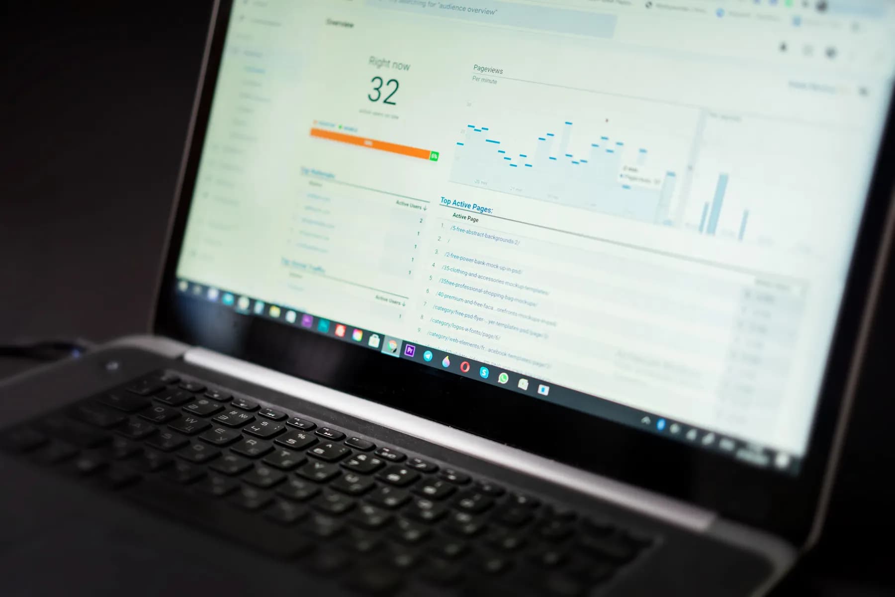
A commerce dashboard should guide a decision, not display everything
The best reporting surfaces tension, explains movement, and makes the next business decision easier to take.
More data can create less clarity
Many dashboards are designed as inventories. Every available number is given a place, so the interface looks comprehensive while the weekly decision remains unclear. A useful dashboard is closer to a briefing. It shows what changed, why it may have changed, and where attention is required.
Start with the operating question
Before choosing metrics, define the decision the dashboard should support. A founder planning cash flow needs a different view from a team improving product discovery. The question determines the level of detail and the comparison that matters.
- Show trend and context together, not a number in isolation.
- Separate leading signals from business outcomes.
- Make unusual movement visible without forcing the reader to search for it.
- Use consistent definitions so teams do not debate the number before discussing the decision.
Connect acquisition to the customer journey
Platform results are useful but incomplete. Revenue, margin, repeat behaviour, and returns give the campaign a business context. Landing behaviour, product discovery, and checkout loss show where the experience changes the value of each visit.
A dashboard earns its place when a team can look at it and agree on what to investigate next.
Design for a weekly rhythm
Strong reporting becomes part of a routine. Begin with the outcome, inspect the main driver, review the most important constraint, and assign the next question. That sequence turns measurement into learning instead of administration.
Make this useful